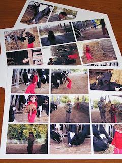
 1. Choose photos. Not every photo you took has to wind up in an album. You may choose to place photos in your album by theme (holidays, the great outdoors, vacations we took); timeline (infancy, early childhood, grade school, middle and high school, higher ed., professional life); milestones in one’s life (birth, growing up, achievements, family); repeating subject (Christmas throughout the years, our Hanukkah traditions), etc.
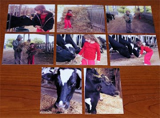
  Here I chose 8 photos that tell my story. There are still too many of them and I know already they won't fit into my layout, so I ordered them in the order of the story to look for duplicates or unnecessary photos. Those will eventually come out and I'll be left with only the most important photos, the ones that 'move the plot'.
3. The layout should upstage your photo. It should help your photo stand out, be the center of attention. If there’s too much glitz and glory
 On the left are the photos paired with the various materials I'll use the make the final layout. I chose 'earthy', natural papers as the scene is our visit to the farm.
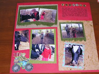
4. Use color to emphasize your photo. Use the color of attention in the photo - in your layout. Or, if the layout is very colorful, consider presenting the photo in black and white or sepia tones. In this case I used red for background as my daughter is weaing, and dark green to match my son's coat.
5. Use shape to focus. By repeating the same shape or angle in your photo, you will help viewers focus on the goings-on of the photo. 
Here the bars of the cow's habitat are repeat in the corrugated cardboard to the left, the hey shapes are repeated on the background paper on the right and the roundness of the cow, plus the cow's eyes are repeated with the bicycle wheels and the matting patterned paper of the cow's photo, as well as the 'farming' title to the right.
Materials credits: Background cardstock 'birthday' by MME; dotted cardstock princess by MME; Glitter cardstock by DCWV; Sticker letters by Memories Complete;Font: Calibri.


Hi, I saw your message and was checking out your blog. I would be interested in putting your link on mine. You can email me at AmonetteN@msn.com
ReplyDeleteGreat, Nicole - thanks:)
ReplyDelete